Same Great Product, New Awesome UX

Yelp Web UI Redesign
I had the choice to choose between six different scenarios, and I chose to re-evaluate the UX and design of the User Detail page on the website.
I ended up producing a radically different visual concept, and some completely new UX strategy for Yelp’s User Detail page. The whole point of UX prototype is to keep users engaged, give them the ability to add a bit of customization to the platform, and to provide a hub for communication and interaction without having to jump all over the site.
But before we get into the new stuff, let me take you through my process.
Process Step One: Getting Familiar
The first step in any design challenge, whether it be theoretical or for a client is to familiarize yourself with the current product, user groups, known issues, and any other relevant information such as KPIs, expected ROIs, etc. These will help you make infinitely better informed design decisions. Then ask as many questions that you can possibly think of. I find the Whys to be especially fruitful. Here’s my overview of that process.
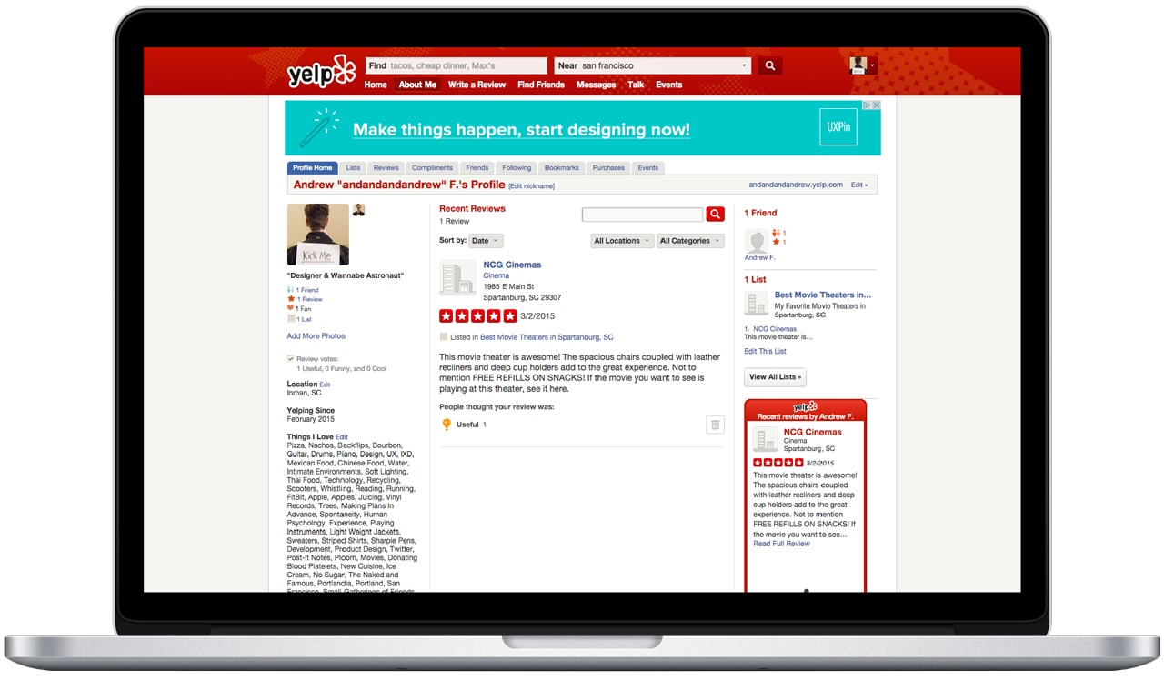
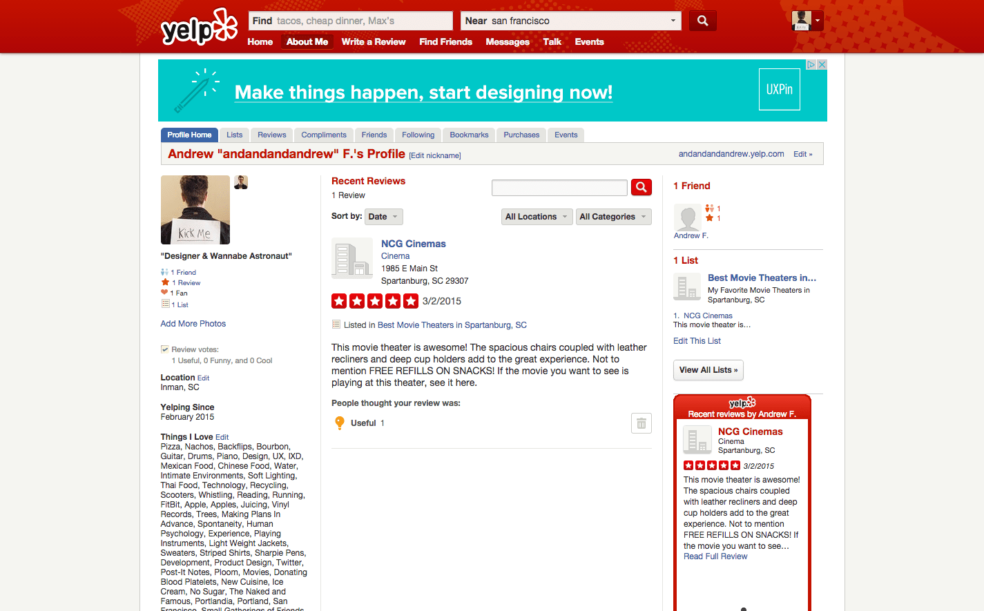
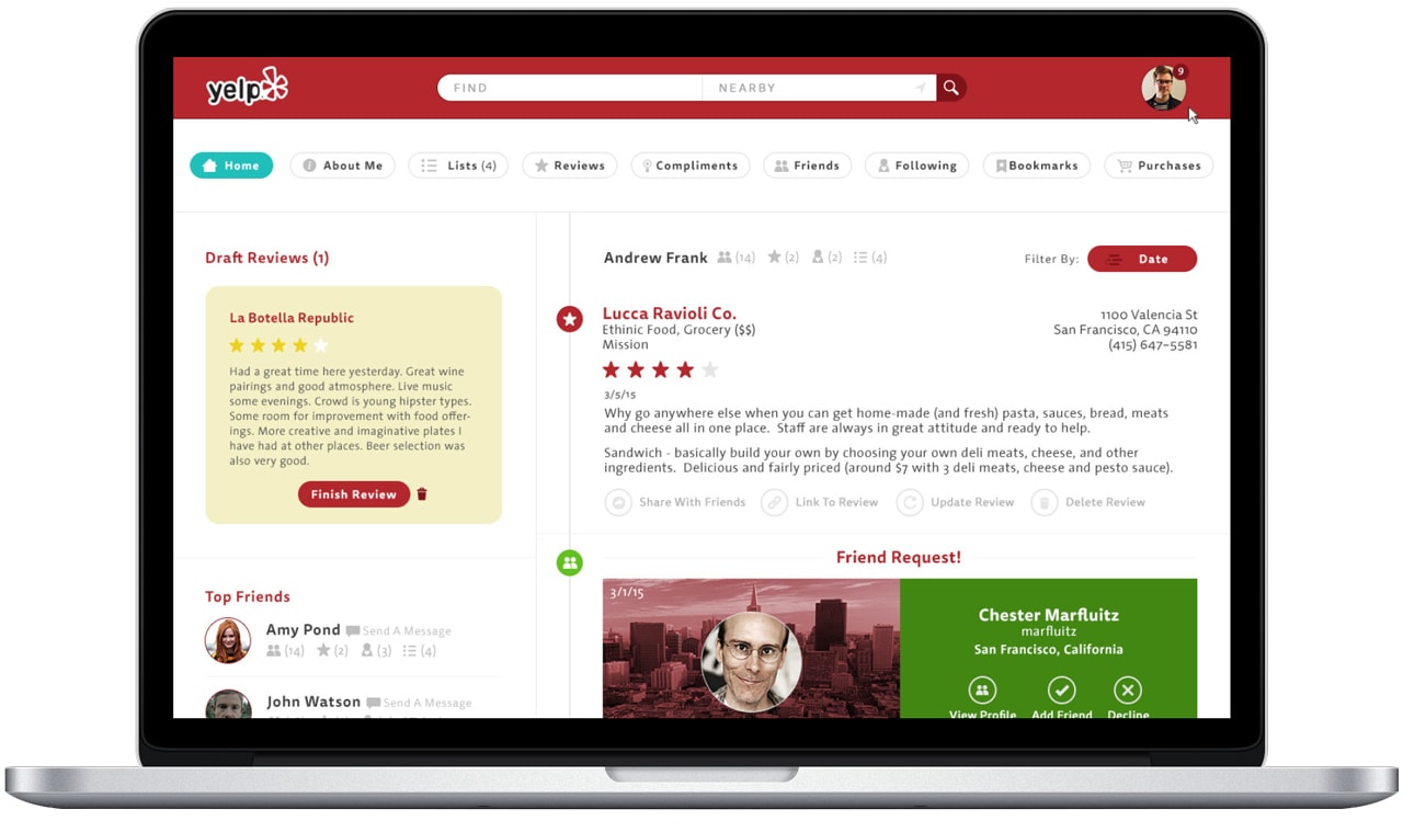
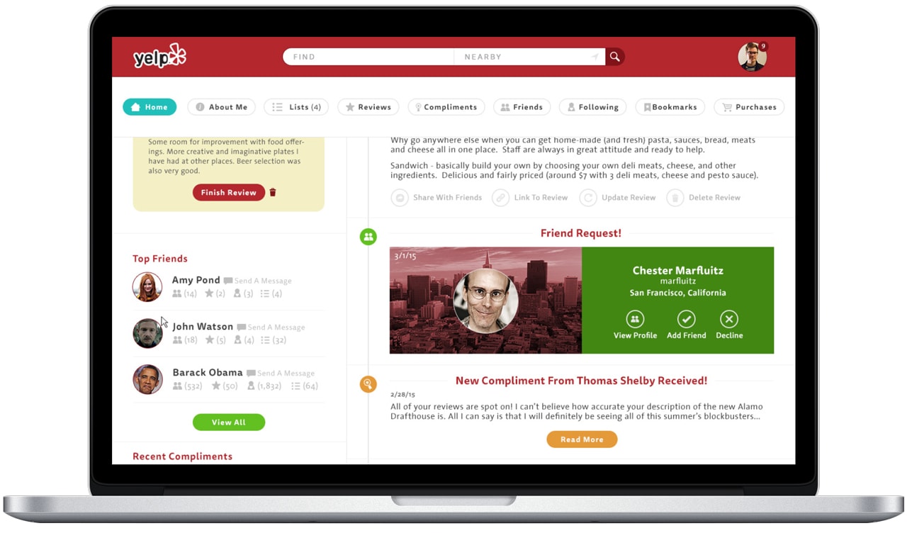
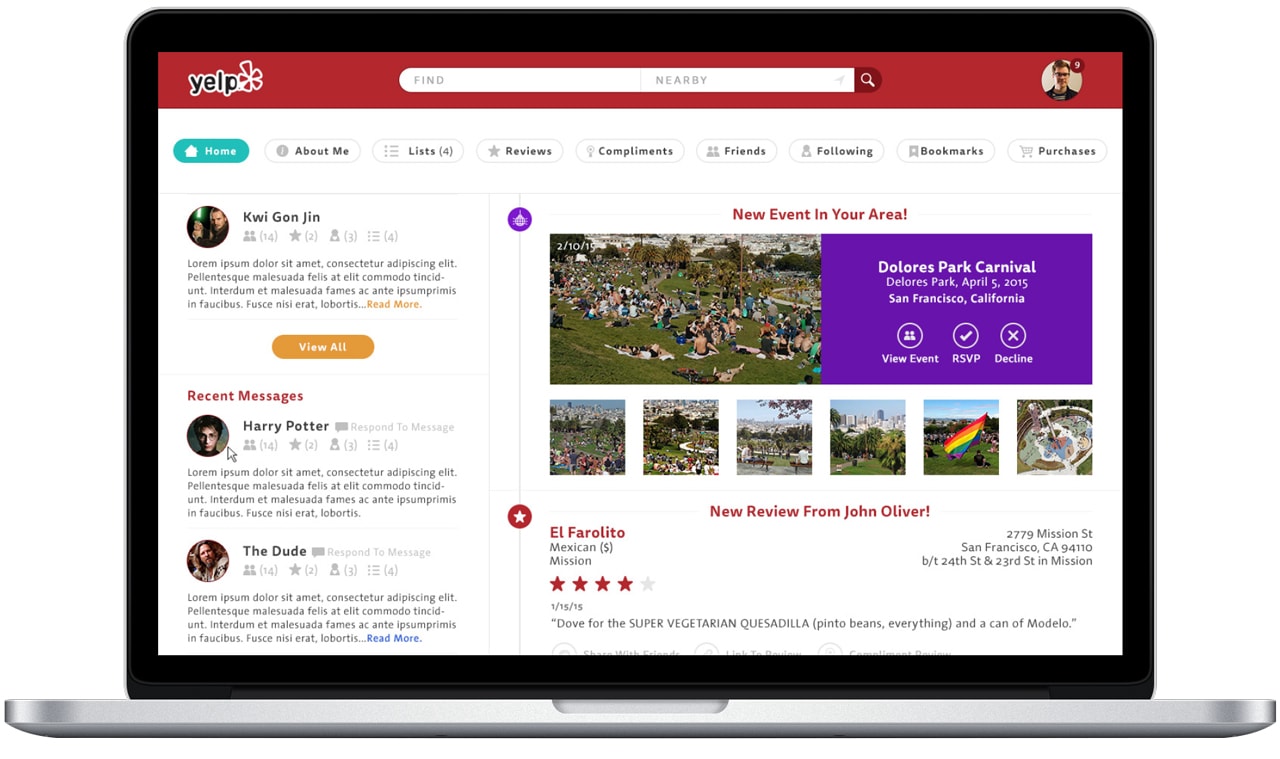
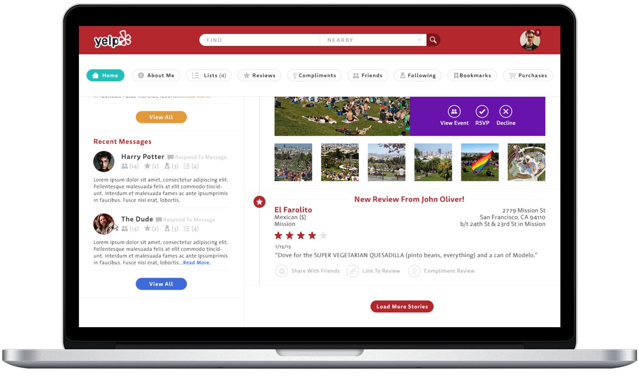
So Here is the Yelp User Detail page as it existed in early 2015:
My First step in the process was to actually sign up for a new Yelp account and experience the application with much empathy as a first time user. I have been Yelping since I got my first iPhone in 2009, but have rarely logged in and actually left reviews or interacted amongst the community. I attribute this to the main feature set not needing a login to be used, as well as not knowing of many features within the app besides search and writing/leaving reviews.
What I found through this process is that the Yelp platform looks and feels severely outdated from not only a UX standpoint, but a visual and interactive standpoint too. Disregarding modern best practices such as proper semantic markup, universal accessibility using RWD techniques, and not keeping the most important tool in Yelp’s utility belt, the search function, with you at all times is a hindrance to users. So before I started redesigning the actual User Detail page, I re-evaluated and redesigned the site’s main navigation system to be more heuristically clear, modern looking, and really making it the driving force behind the app.
Repeat the process until you know it as well as you can. Take all of the notes while discovering the app even if they seem irrelevant at the time. This is the first step towards user-centric design, and achieving empathy with users along the way. Then it’s time to start asking questions and coming up with new KPIs based on your observation.
It’s time to find out what happens when people stop being polite… and start getting real. ;)
Process Step Two: Question Time
Question time is neither a job for a single person, or for someone who has little to no knowledge on the subject you are questioning. You want to ask as many questions and gather as much information, especially on your users, prior to getting into any design. Up until now you have been experiencing and thinking about your own time with the product—time for as much outsider information you can gather. This can be from app store reviews, google, or most preferably, someone who already has all of this information from their experience with the product and user groups. For my research into this part of the project I read many iTunes app reviews and Yelp reviews to get the gist of what people were comfortable with or unhappy with the Yelp platform. Ideally I would submit a long list of questions to be answered on Yelp acquired metrics, but with such a short timeline for this project, I had to find my own route. I had to set my own personal KPIs & ROIs.
Process Step Two and One Half: Let it Marinate
I find that letting all of your own thoughts and the collection of data from others is best if left to marinate in your mind for a bit before moving on to the next step. Of course this marinating time can vary from 10 minutes to a week, or sometimes you don’t have to let it marinate at all. For this challenge, I gave myself a day to just think internally about all of the data I’d collected from using the app, reading app store reviews, playing with the app more to get my mind in the right place to start making things.
I found myself coming up with more and more ideas, concepts, new features for the app and questioning strategies I thought were already 100% sound in my mind after my marinating period was through. I went for a run whilst marinating in the stew of my thoughts, and came back with four or five new ideas which I immediately wrote down as to not forget.
It’s so important during this process that even though you are passively thinking, you are still thinking critically, and it is so important to write down any ideas as you have them. That’s why my sketchbook now looks like a user’s guide to Yelp’s User Detail page. I’m lucky in this regard, because my brain never turns off and sees a million different ideas and strategies all at once, and how they fit together like a puzzle; I think in a linear all–inclusive way, always critiquing as the process unfolds.
After you’ve had some time to digest everything, it’s time to re-read your notes, and start tearing the current UX & Design apart and identifying pain points, spots for new features. I like to call this next phase Storytime.
Process Step Three: Story Time! Yay!
Who doesn’t enjoy a tall tale? I call this section of my process Storytime because it is the part of the process where I piece everything together in my mind after applying our wonderful marinade to it. Now this part of the process doesn’t always equate to writing; this part can be a group conversation, a session with a white board, or even just a series of sketches, flow charts, or a big ass checklist. The point in this step is to organize your thoughts in a way that you can then re-observe them, and sometimes tweak the meaning behind your choices without any true visual representation yet.
The way I’ve come up with my philosophy on design theory/process and execution is to visualize a giant ball of yarn, made of two completely identical looking pieces of thread that have been rolled up into the ball. One string represents what I call the intellectual/cognitive processes that involves the critical consideration of users, flows, and anything intangible. The second string represents the atmospheric part of design, which is all inclusive of any stimulus (we focus on mostly visuals as graphic designers mostly, but need to pay attention to all things as product designers) that acts as a cue for a user to begin engaging with the pre–planned intellectual process.
Process Step Four: Identify
Now begins the fun part. After you’ve had Storytime, it’s time to start identifying problems, pain points, visual or interactive language inconsistencies, but more importantly, opportunities for improvement! So, I start by tearing apart the current UX and design, pointing out pain points and inconsistencies that I suspect contribute to a less than desirable ROI you’d like to be getting on any given day.
Pain Points Identified:
The current Yelp user detail page has many commonly seen mistakes that are fortunately easy to remedy or at least deal with. But before we get into specifics, there are many site-wide issues that add to the problem of the User Detail page; these include a narrow viewport for content, not utilizing the entirety of the screen, the cluttered and repetitive navigation, lack of user customizability (adding as many profile pictures you want does not count in this case!), and a very antiquated design language. A case for the site being made responsive can be made with much supporting evidence, even though Yelp provides stand alone apps for smaller, hand-held devices. But that is not a legitimate reason IMO to not use current industry wide and accepted design and technology on the site.
Aside from being visually and from what I can tell (website wide anyways) outdated, the UX of the User Detail page has many issues that I tackled for this test. But before I could really get into my solution, I first had to rectify and set some rules for this newly re-factored UX and design:
- Narrow “tube” of content, most likely designed for tablet specific widths.
- This creates a lack of accessibility, especially nowadays with RWD finally at the point where designers & developers know how to implement it properly.
- Lack of using the entirety of the screen real estate.
- Antiquated and non-semantic HTML markup.
- Lack of any aria-roles or other accessibility roles in the markup.
- Again, NOT RWD! This is a big one that needs to be considered over and over.
- Cluttered and repetitive navigation system.
- Lack of user customization.
- Antiquated design language.
BLANKETS ARE NICE AND SO IS YELP!
Now I am not an authority on this app but I have spent a lot of time using it and identifying things that just don’t jive with me, or other users (I assume). Basically the only way to put this is that Yelp does exactly what it’s supposed to do—provide an online space for users to submit their personal reviews of business from all walks of life, and to some extent interact with other users. But that interaction between users is truly the main issue I have discovered during this challenge.
I blame this mostly on the lackluster and under-designed User Detail page that does not nurture these person-to-person interactions as much as it can. It fulfills the need for providing the latest news (including reviews, etc) right on the page, but there isn’t much else there to interact with. This leaves much left to be desired, even if you don’t know it yet!
So the solution is to be as holistic and nurturing of person-to-person interactions on the User Detail page as possible, while still maintaining the aspect of serving up the latest news, and adding more interaction points for users to get involved in their Yelp communities. This can be done by adding features that make sense to that goal.
Process Step Five: Concepting & Wireframing
Concepting to me is basically coming up with a thesis statement and some supporting facts to back it up. Since I just tore apart the UX and design for this challenge, I think you can see my supporting evidence to my blanket statement (not that Yelp is nice, but the app’s current downfalls and my supporting reasons for that statement).
Now I’m not so sure this is unique to me, but unless you’re working with a client who needs to visually see everything, wireframes sometimes hinder the process for me—especially when I don’t agree with them. This is where I excel—I am able to see my ball of yarn all at once. UX and user research, especially for an app as massive as Yelp cannot be overlooked. Wireframes are one thing, but the research behind your users is where your solutions truly lay. I think the process of designing becomes much more intuitive if you use the research thoroughly, then use wireframes, flow charts and lists merely as points of reference. The design process becomes much more empathetic towards your users and intuitive for the designer in my opinion.
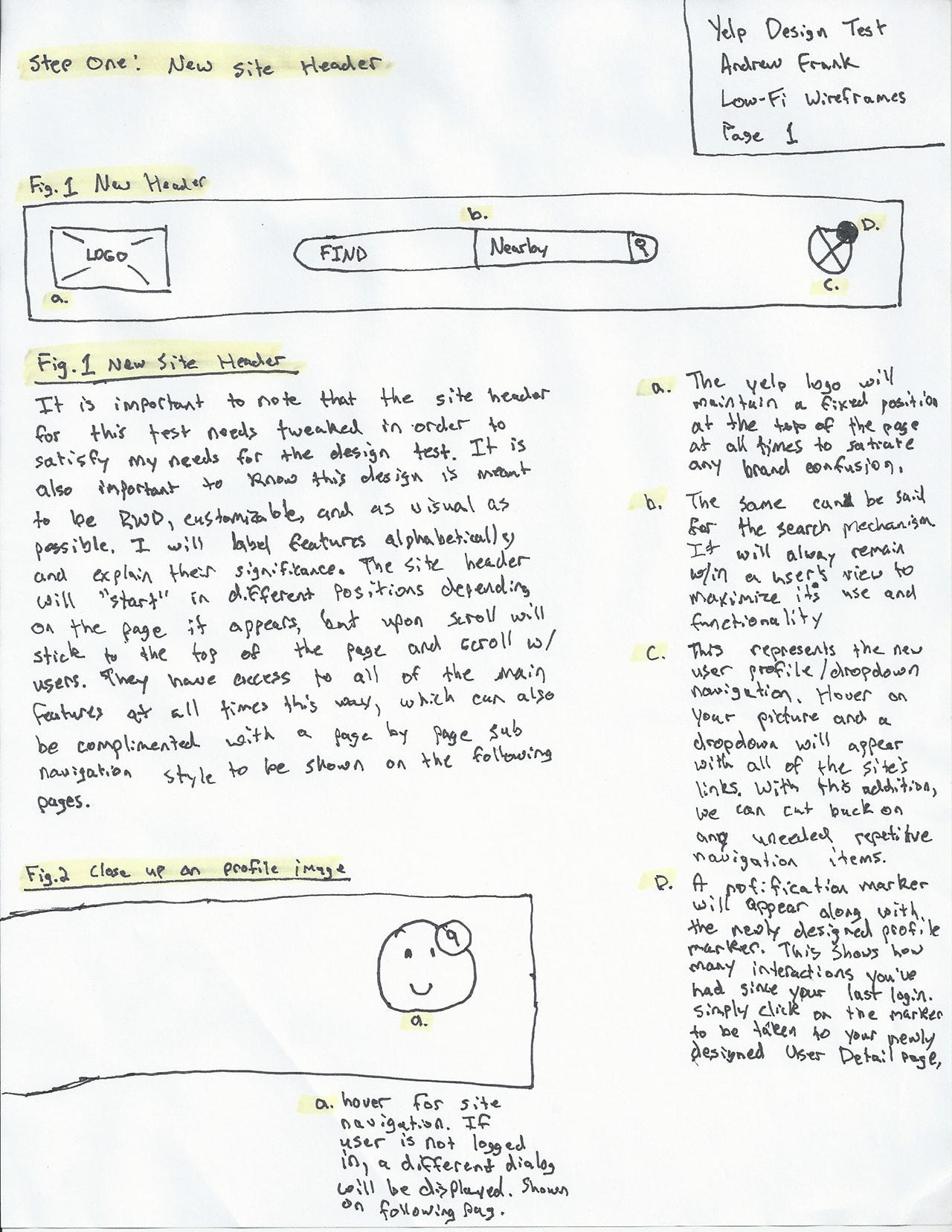
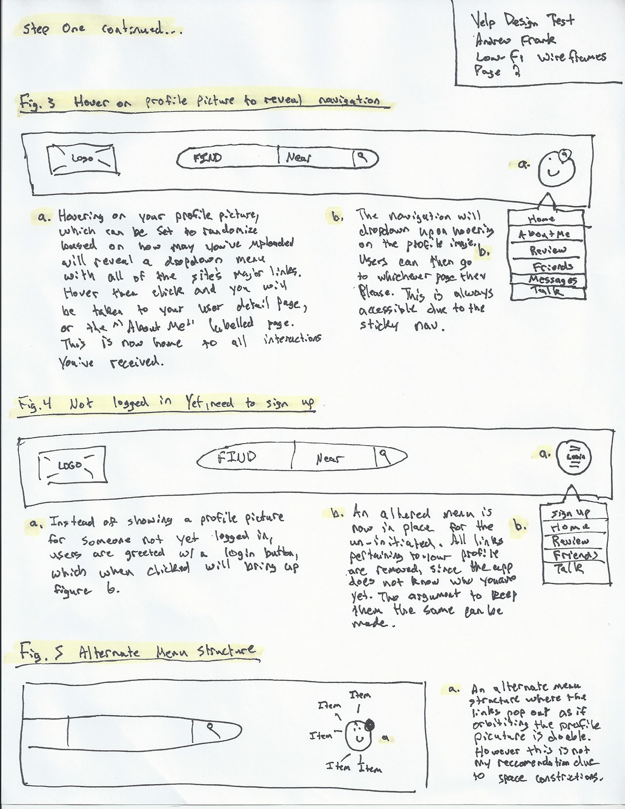
If I’m working on a project by myself, or with like minded people, conversation and post–it notes do just fine. I like this approach because it’s fast, you can reorganize quickly, and there’s no real visual tied to it. It is more about architecture than it is about experience, but that’s a whole other conversation on my opinion of what UX really is. The following page begins my concept with some low-fi sketched out wireframes. Enjoy!
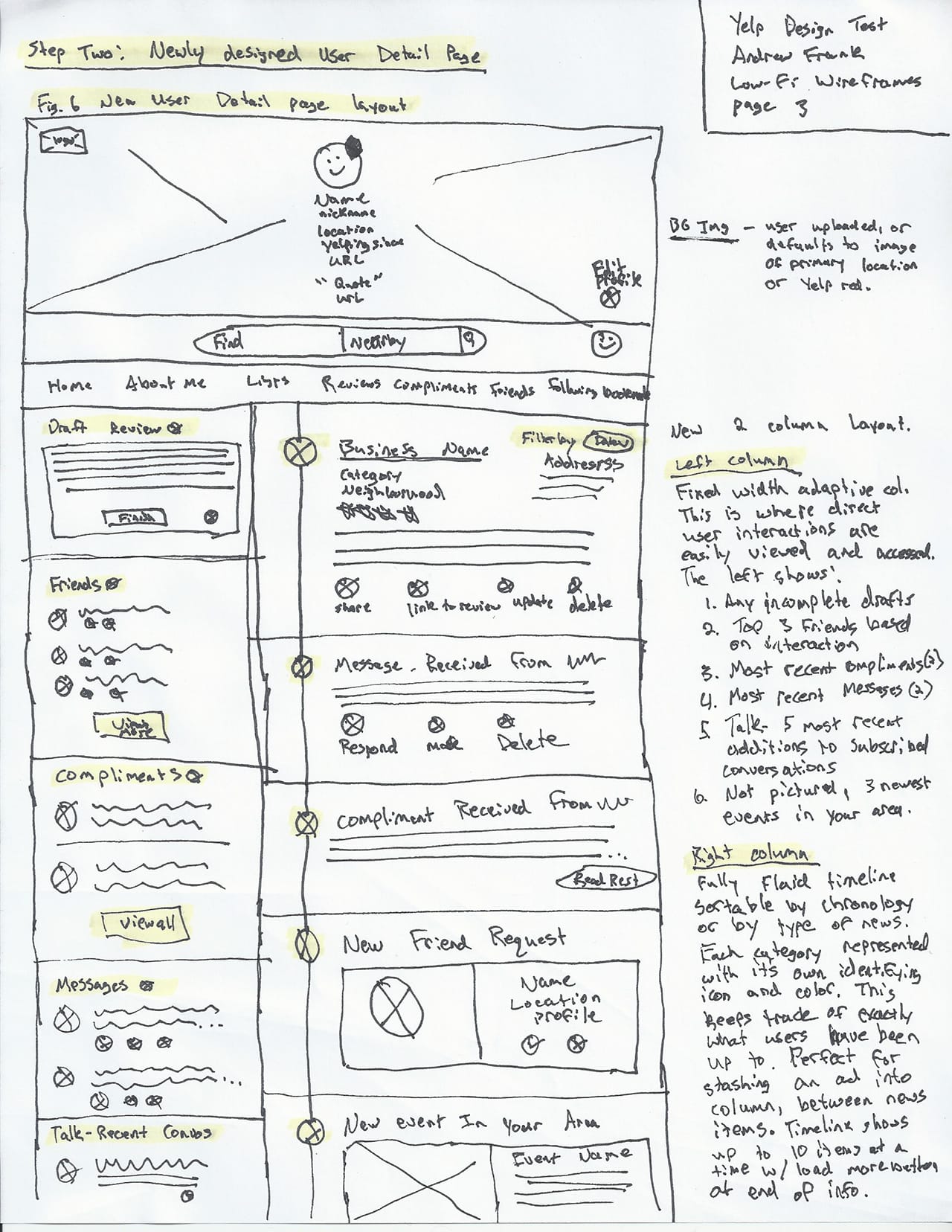
Hi-Fi Comps Starting with the Tube
New UI, New UX
This project did not require mid-fi wireframes, so I went straight from my sketched out wires to full on design.
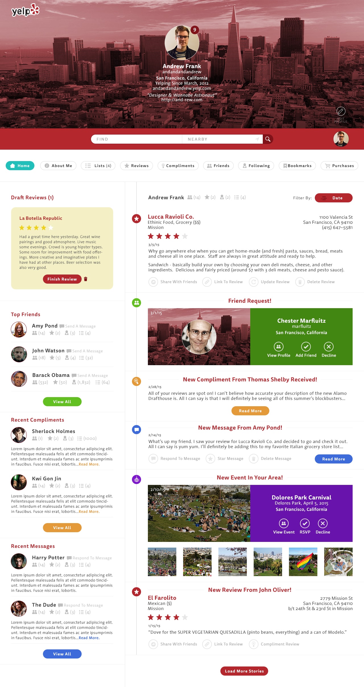
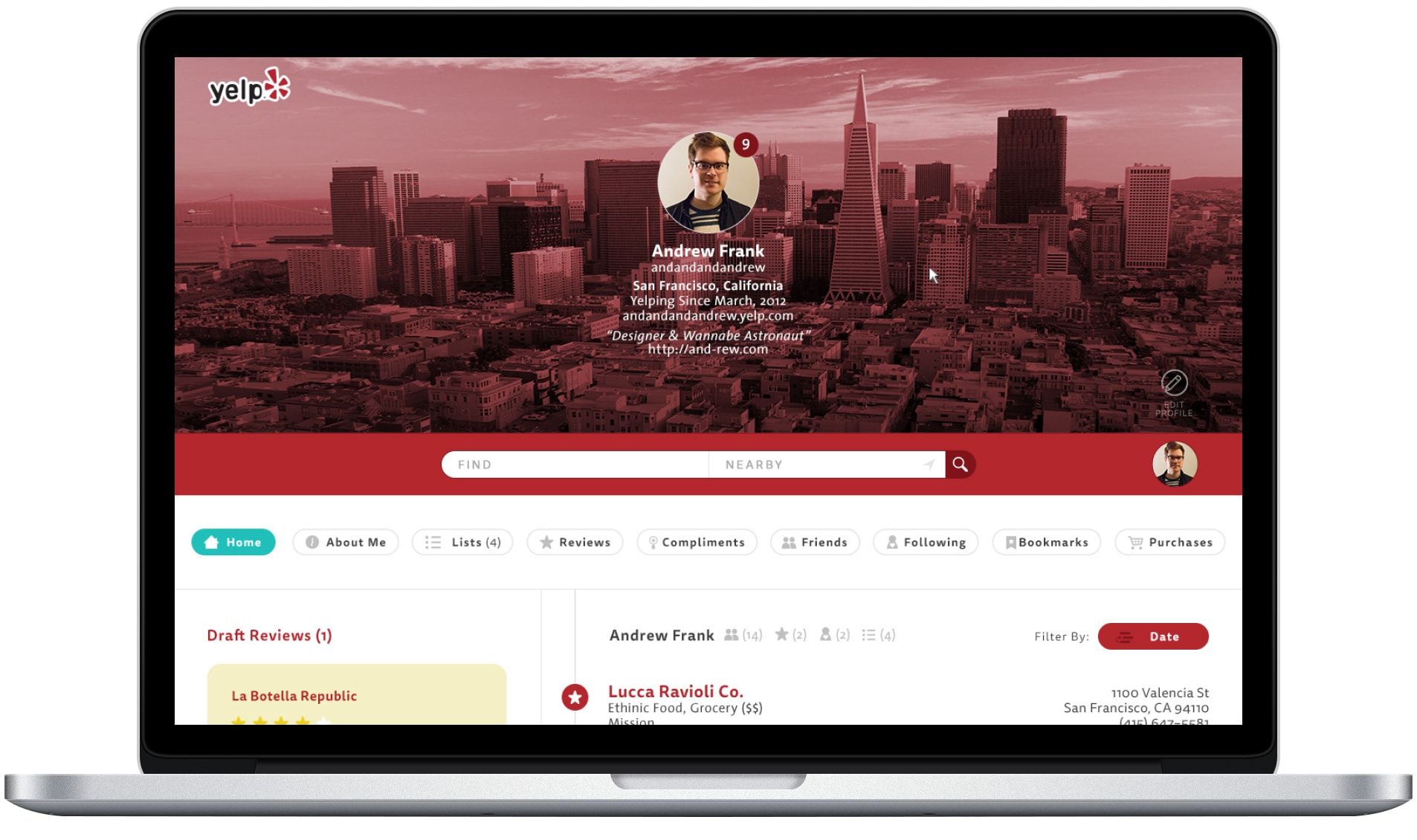
Right from the first load of the page, the architecture change is apparent. By reorganizing where information on the page falls, Yelp would be able to introduce new user to user interaction, as well as increase the functionality from just one page in the site.
All About The User
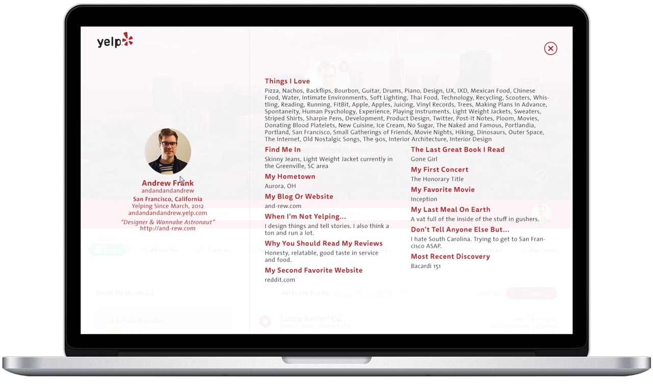
In the current iteration of Yelp’s UI & UX, you have to navigate to multiple places in order to view all of your personal user information. With this solution, not only can you see it all on one page, but you can also administer it as well. A simple modal layover allows you to view your information without leaving the page. This also adds a more omnipresent social element to the platform by allowing other users whom visit your profile to read about you, see you reviews, and any shared values to see if you can trust their reviews.
Please don’t take my search bar away!
The most important UI element to deal with on this page is definitely the search bar. I mean, how else are you supposed to find all of those Pokéstops? In Yelp’s current UI you end up scrolling all over the place in order to find the search bar again. With this new UX, your most pertinent information snaps to the top of the page on scroll. No more jumping around pages looking for that pesky search bar!
Yelp Reviews! What about Yelp social?
For being one of the leading platforms for finding restaurants, entertainment, etc, there is much left to be desired as far as social interactions. What do you do when you find that kindred spirit in Yelp that thinks that burrito joint down the street is literally the best thing in the world? With this new UX/UI, I felt it is pertinent to introduce this functionality right on the page. So from adding Friends, commenting on reviews, composing reviews, you can now do it from one simple and well-thought-out dashboard view!
Communication with other users.
If you can’t communicate with other users about reviews, pose questions to them if you’re visiting a new city, what’s the point in having a rating & friend function? So that leads us to on page messaging between you and other users. A dedicated Messages page will compliment this new User Detail/Profile page
Before & After: